Designing challenger banking: the brand challenge
Banking applications are historically dry, clinical, and visually dense. Navigating current accounts, checking interest rates, or reviewing personal budgets often induces unnecessary cognitive fatigue. For Opi Bank, a modern challenger brand, the challenge was to design a mobile-first responsive banking interface that remains highly accessible while breaking the corporate aesthetic.
I was tasked with designing a responsive user interface system that translates the brand's unique identity into polished design components. The core goal was to ensure the interface meets strict accessibility guidelines without sacrificing the brand's vibrant, human-centered character.
How Might We Statement: How might we design a frictionless banking dashboard that balances playful visuals with clear, trustworthy security and WCAG AA+ accessibility standards?
Establishing the visual foundations: mood boards & brand identity
To establish a strong design direction, I curated a comprehensive mood board to align visual aesthetics with the brand values. The mood board explores modern gradients, soft neumorphic shadows, and accessible card layouts, acting as the foundation for the visual direction of Opi Bank.
Alongside the mood board, I designed the brand logotype and icon. The brand identity features friendly, curved geometries and a high-contrast palette to ensure instant brand recall while maintaining extreme legibility even at small dimensions on mobile screens.
Translating brand values into visual interface assets
I translated Opi Bank's challenger brand values directly into digital styling components. I selected and crafted the typography scales, color palettes, and iconography styles specifically to satisfy our three user experience pillars:
Clear 💎
Reducing information overload. I curated a strict typographic hierarchy utilising size contrast, established a clean horizontal grid system, and maintained generous padding so account balances and actions are instantly scannable.
Playful 🪀
Evoking positive engagement. I designed a friendly but professional color palette with bright neon highlights, combined custom spending category iconography, and introduced soft container corners to create an approachable banking space.
Trustworthy 🔒
Reinforcing security and feedback. I structured high-contrast callouts for card management, created clear transactional error-prevention states, and ensured all data is visible without hidden dropdowns.
Layout structures: grid systems, components, and wireframes
Consistent alignment is the key to clear design. I designed the responsive layout using a rigorous 8px grid system to ensure spacing between cards, text labels, and interaction triggers scales fluidly across device widths.
I structured a comprehensive component library in Figma (containing modular action cards, input selectors, buttons, and switches) to keep layout components reusable and consistent. I then mapped the structure using low-fidelity grayscale wireframes to evaluate visual density before styling.
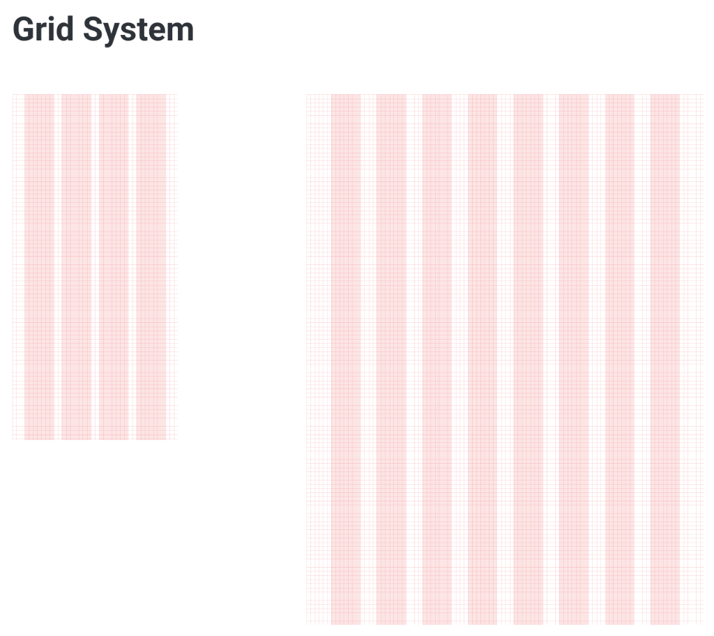
Responsive layout grid system outlining spacing, margins, and column layouts for mobile and desktop viewports.
Design progression: initial iterations to layout refinements
Visual components evolve through continuous evaluation. I designed the first layout iterations focusing on element sizing and card groups. Reviewing the initial visual hierarchy revealed readability bugs: transaction values were too small, and chart controls lacked clear touch borders.
I iterated on the cards, introducing higher-contrast borders, bold numeric indicators, and spacious spacing grids. This progression resolved structural issues before freezing the final challenger banking dashboard layouts.
The final challenger banking interface
The final visual layouts deliver an engaging banking space across three key pages, aligning layout properties to meet user expectations of a digital challenger app:
WCAG AA+ accessibility audit & interaction states
Accessibility was treated as a core design parameter rather than an afterthought. I designed the app components to meet and support the WCAG AA+ standards, performing checks across color contrast, interaction target regions, and keyboard compatibility:
- Contrast Verification Verified all text-to-background combinations using contrast checkers. Crucial monetary figures and alert messages maintain a minimum 4.5:1 ratio (reaching 7:1 for headers).
- Touch Target Dimensions Mapped all interactive components (buttons, toggles, account tabs) to maintain a minimum size of 48px x 48px to prevent input errors on mobile.
- Visual Cues & Focus states Designed highly visible keyboard focus rings and status feedback colors, ensuring error messages never rely solely on color codes to convey meaning.
Reflecting on the design process
Reviewing the lifecycle of the Opi Bank interface highlights valuable UX/UI learnings and outlines opportunities for future layout development.
What went well: visual simplicity & brand alignment
I am happy with the general style of the designs. It is modern, simple, and clean. I feel I have translated the brand principles well:
- Clear: The layout is clean and clear with generous spacing and room to breathe, making the account data easily viewable. There are very few unnecessary visual elements (such as drop shadows), keeping user distractions minimal.
- Playful: The way in which I utilised colour brings a certain playfulness to the design without it being distracting or overbearing. It brightens the UI while remaining functional—for example, viewing different accounts results in the header and background changing colour to match.
- Trustworthy: The typography choices promote an element of authenticity, with more traditional serif typefaces utilised for transaction numbers and values. The lack of visual clutter creates a sense of calm while displaying large amounts of financial data.
I successfully incorporated core design principles across the screens, including proximity, grouping (chunking), similarity, symmetry, continuation, closure, affordance, and visual hierarchy. I am also happy with the logotype designed for the bank—the logo features a friendly curve combined with the 'o' and 'p' characters to create a memorable, smiling face.
Areas for growth: balancing style and visual depth
However, I feel the designs are potentially overly simple, lacking depth in certain areas. Perhaps a greater use of subtle textures in the background could have added extra style.
From the initial mood boards, I felt that a bolder layout could have worked. However, during testing feedback rounds, the less subtle elements were highlighted as being distracting to users. Given more time, I would explore how to incorporate more visually striking elements in a way that remains functional and non-distracting to the user.
Additionally, the initial type styles I designed felt restrictive and limited. In future iterations, I will plan more carefully to create a larger variety of styles and sizes for complex banking states.
Next steps: interactive prototypes & dark mode expansions
With unlimited time to work on this project, I would focus on:
- Absolute accessibility: Designing complete dark mode alternatives for every viewport screen to support low-light visibility.
- Additional user flows: Extending the component library to show account card re-ordering and dashboard management.
- Interactive animations: Building a high-fidelity prototype showing how elements animate, slide, and transition.