Designing for offline-to-digital car rentals: the context
The client is a small, family-run business providing local car rental services. Historically, the company built a loyal customer base through social media and word of mouth, relying entirely on phone calls and WhatsApp to manage reservations. With growing demand, this manual model became unsustainable.
I was hired as a freelance UX designer to research and design their very first website. The core goal was to transition their customer base to an online portal, ensuring the interface is intuitive and accessible, while avoiding the dark patterns and hidden pricing structures common on mainstream car rental platforms.
How Might We Statement: How might we design a frictionless car rental search and booking experience that builds user trust and minimises drop-off rates?
Uncovering booking friction: usability testing insights
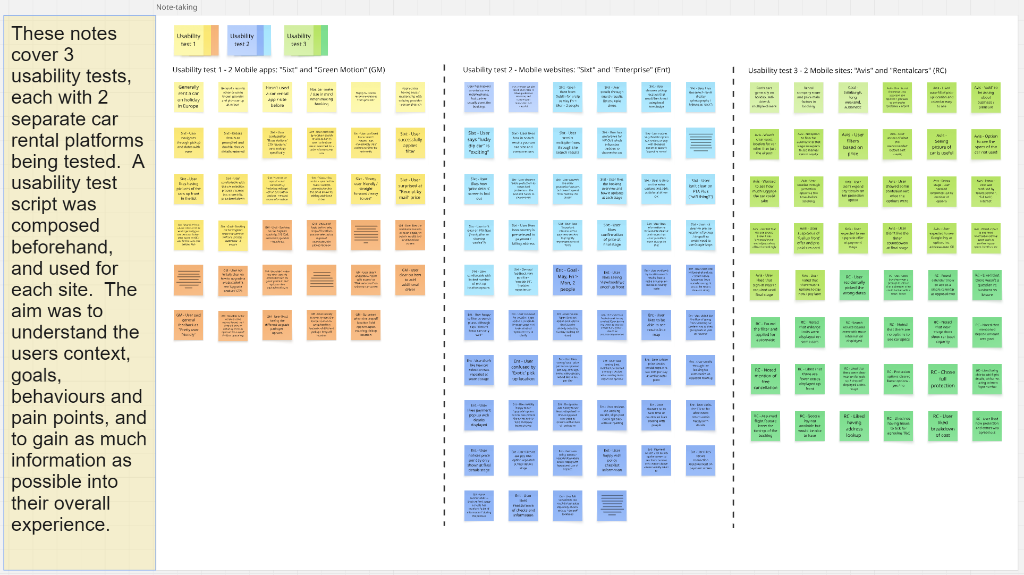
Rather than jumping straight to designs, I structured and conducted remote moderated usability tests with representative users on competitor sites. The goal was to identify where users drop out during vehicle selection.
During testing, I observed that users experienced immediate cognitive fatigue when presented with complex vehicle option lists. Rather than moving forward, they spent significant time trying to decode pick-up terms and insurance conditions. To address this, I composed bias-free discussion guides to allow participants to discover navigation bottlenecks naturally, recording exactly how they behaved.
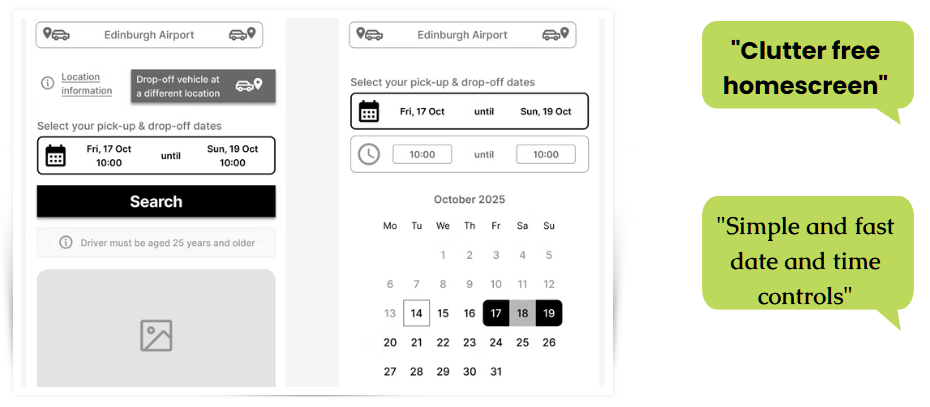
Participant testing showing user interactions on date and calendar selectors.
Competitor protection plan testing highlighting user confusion and visual clutter.
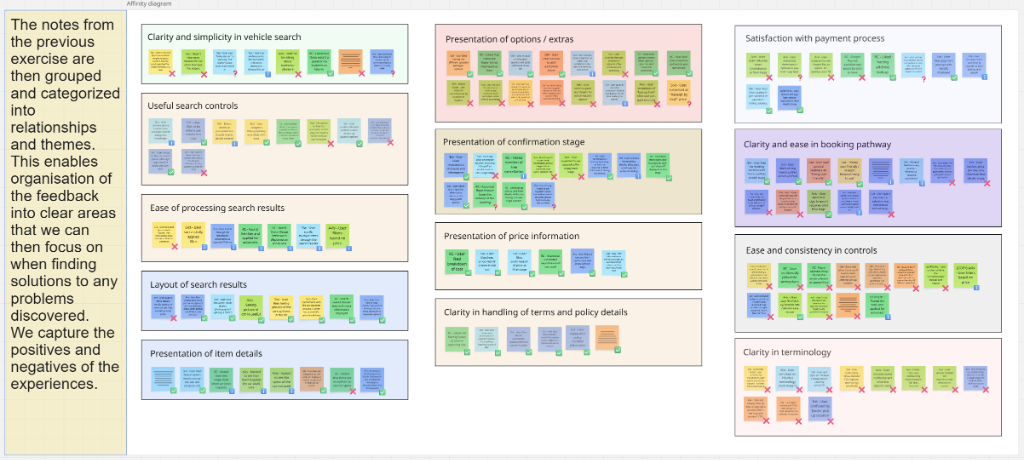
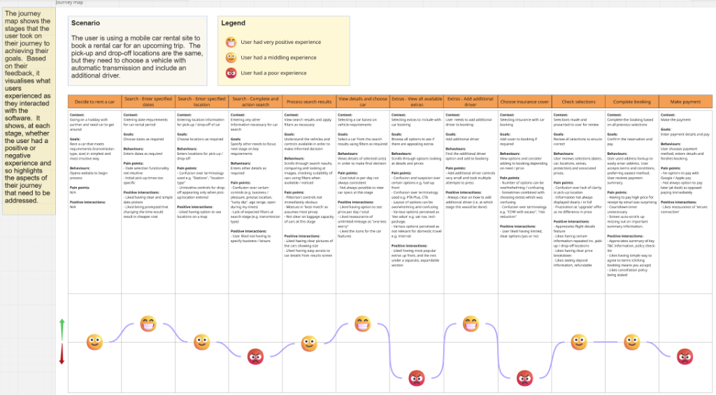
Synthesising user pain points: pricing ambiguity & vehicle sizing
I synthesised the user observations into affinity mapping clusters and customer journeys. The research yielded three specific learnings that directly shaped the design requirements:
- Anxiety Over Hidden Fees 100% of tested users expressed severe frustration when mandatory surcharges or CDW (Collision Damage Waiver) fees were hidden until the payment screen, causing transaction dropouts.
- Unclear Documentation Rules Users felt confused and anxious about the exact documentation requirements and security deposit values needed at the pick-up counter.
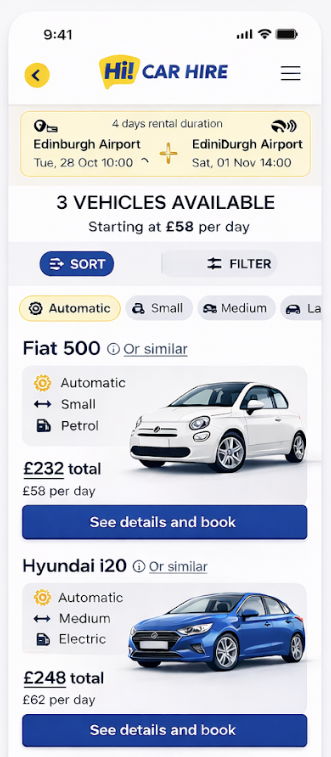
- Vague Luggage & Size Indicators Standard vehicle category labels (e.g. "Compact") failed to help users understand if their specific travel bags or family luggage would fit in the car.
Friction reduction: simplifying the booking pathway
Mapping the user workflows exposed severe booking fragmentation. In the **First Draft Flow**, the user had to navigate 7 separate screens to search, filter, select extras, choose protection, and confirm details. This created multiple high-risk drop-off points.
Applying core interaction design principles, I streamlined inputs, touch target dimensions, and confirmation states. I consolidated the flow into a logical 4-step sequence: Search → Filtered Selection → Unified Extras/Protection → Transparent Checkout.
I then sketched out paper layouts to map out how filtering controls and optional items would expand and collapse on the mobile screens.
First draft flow (fragmented)
Refined final flow (consolidated)
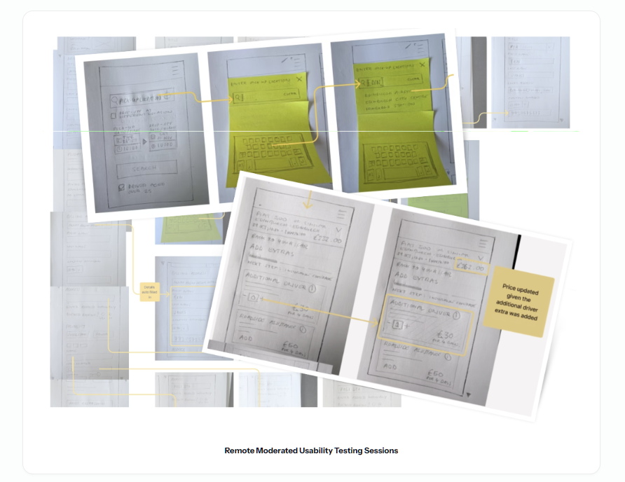
Sketched wireframes mapping out pickup location inputs, date controls, and checkout options.
Interactive mid-fidelity wireframe prototype
I translated paper layout sketches into an interactive mid-fidelity Figma wireframe prototype, testing search forms, calendar rental selectors, and initial details confirmation.
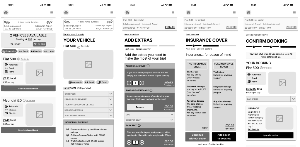
Mid-fidelity wireframe flow mapping vehicle listing, detailed specifications, extras selection, insurance covers, and booking confirmation.
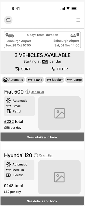
Design evolution: aligning wireframe structure with high-fidelity clarity
The evolution of the user interface shows how the initial wireframe structures were translated into finished high-fidelity components, focusing on clear information hierarchy, readable data tables, and interactive states:
Visual & component progression
I translated the structure established in wireframes directly into polished interface details. The wireframe focused purely on element size and grid layout, which made it easy to align labels and CTA hit zones.
During final visual styling, I focused on high-contrast contrast ratios, readable numbers, and upfront pricing labels to maintain transparency.
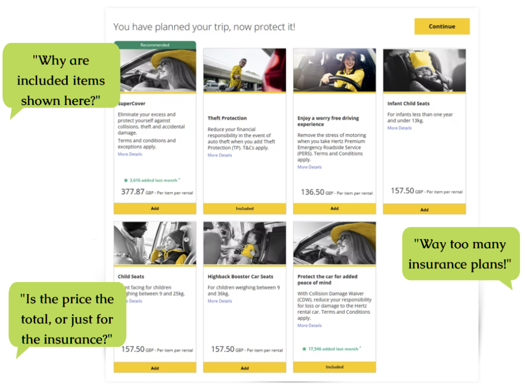
Iterating on design feedback
To refine the user interface and validate usability further, I gathered final design feedback from user tests. Based on their reactions, I addressed specific concerns surrounding pricing breakdowns and option layout densities.
Usability comments detailing overall layout clarity, process steps, and simplified options.
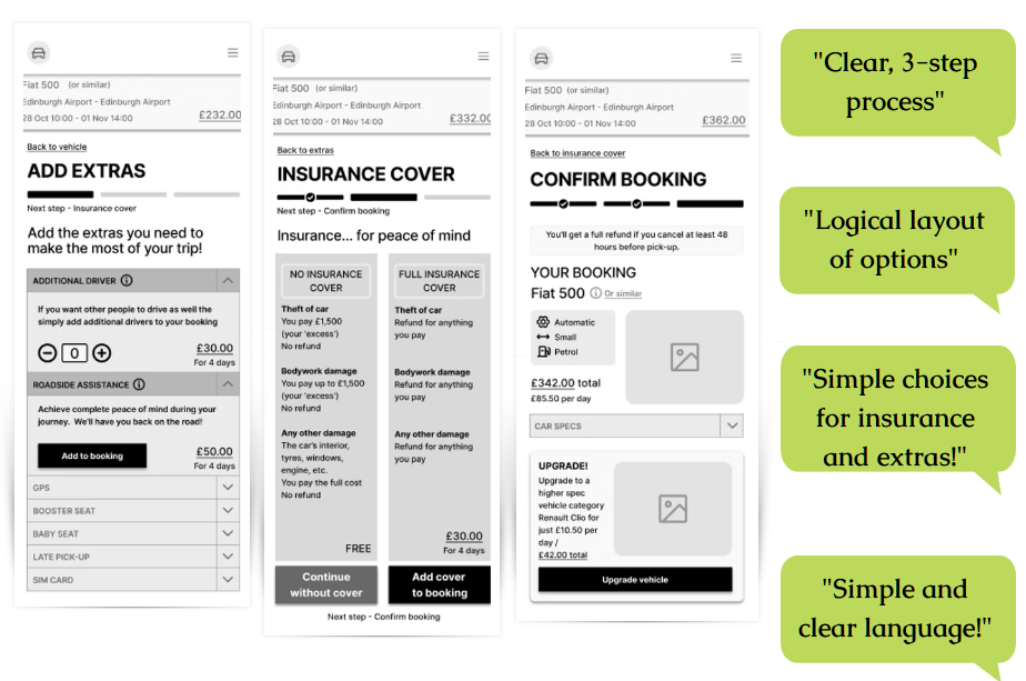
Test comments confirming clear hierarchy, visual clarity, and simple language cues.
Developer hand-off: interaction state blueprints & accessibility rules
The blueprints below highlight the interaction patterns, component state definitions, and accessibility features designed for the development handoff.